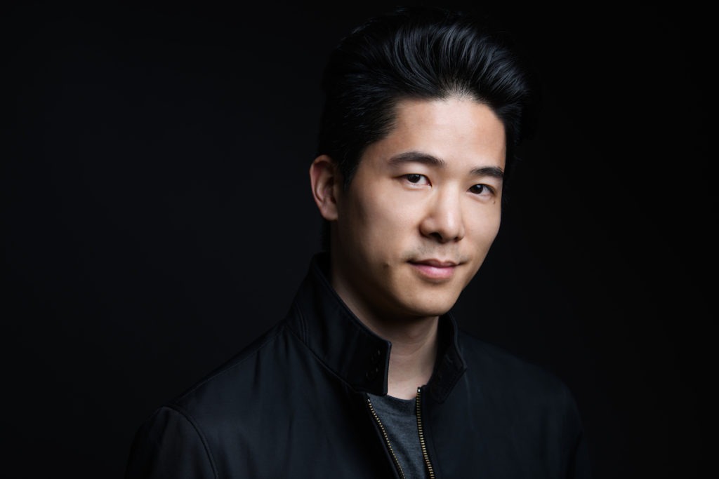
Just a quick note to say that I've updated my live music portfolio. In addition, I've added a series of portrait/promo images to the portfolio page as well. I'd love to hear your thoughts on the new sets, let me know what you think!
Since I started shooting more portraits in late 2008, I thought it was finally time to put together a proper portfolio for this small body of work. While it's still quite new, I'm really excited to expand this series over the next year, and putting these images out there is one of my motivators.
Both portfolios were refreshed with an eye toward the tips for making a portfolio that I posted last year, but you'll have to keep me honest. Let me know if I didn't follow my own portfolio advice.
Regarding the organization, the live music portfolio is relatively unchanged in format and alternates between horizontal and vertical images throughout the slideshow. The portrait portfolio, on the other hand, divides the different orientation, with horizontal images first followed by the vertical shots.
Does one format work better for you? Have your say!
You can view the new portfolios here.
PS: Are the two slideshows too much to load at one time? Let me know how the portfolio page is loading for you.

